Fundación NEOS commissioned the identity system for a historical memory app about ETA attacks. The app works on a map: based on the user's location, it shows what happened there, with historical data and consequences. The scope was an MVP. Another team was already working on the interface implementation, so the deliverable was the branding: color palette, typography, logo and its variations, iconography, textures, and documented typographic layouts, along with guidelines for the other team to apply the system. The brief included one recommendation on color: avoid red, to prevent any direct association with the violence of the events.

The challenge was conceptual, not aesthetic. When a brand about violence focuses on death and pain, the user feels like they are consuming something. When it focuses on information, on what they can learn, they feel like they are doing something. The app speaks about something that happened and left a mark, and the branding had to operate from that second place: carry weight without becoming heavy, generate presence without leaning on tragedy.
The concept I worked from was absence and presence. The app exists to fill gaps in memory that people carry without knowing it.
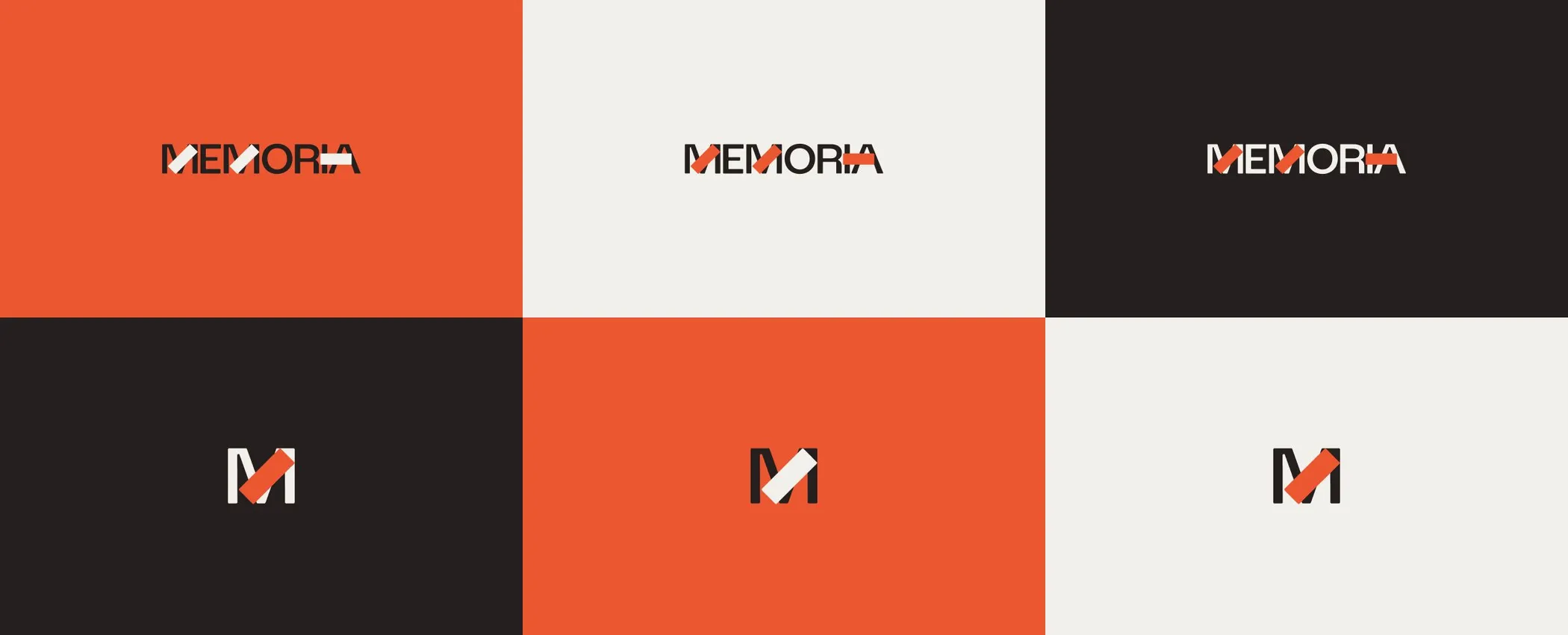
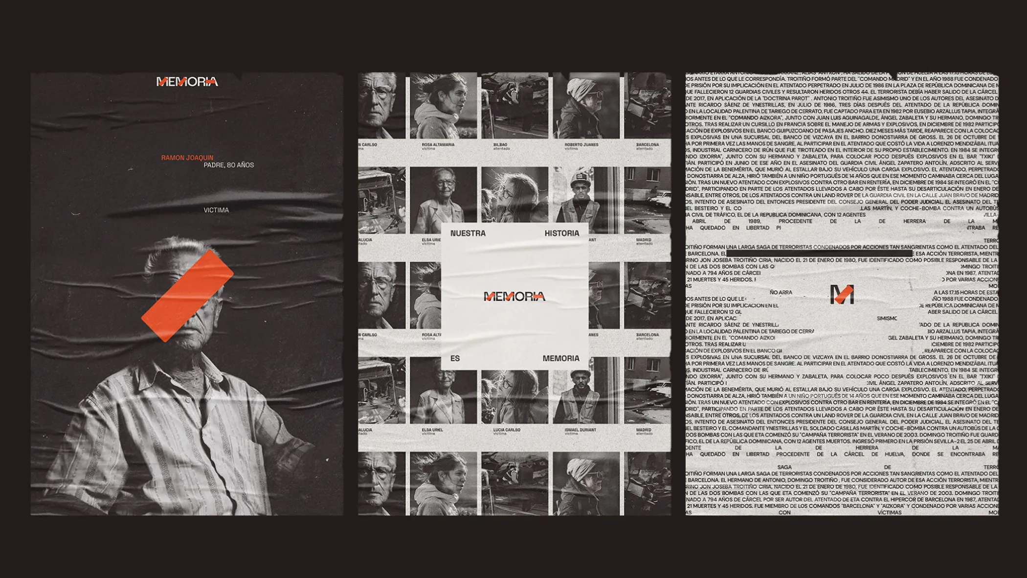
For the logo I proposed writing MEMORIA with internal gaps in the letters: the word remains readable because life goes on, even when something is missing. The client received it well but reframed the meaning: those spaces are what the app is there to heal. That comment made me rework the concept and define the gap as the band-aid, representing both the scar and the healing, connecting back to the original concept.

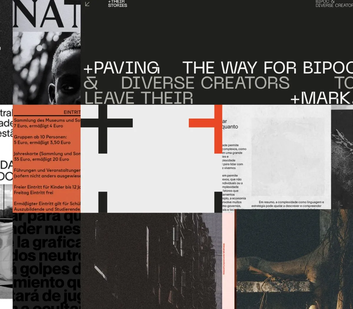
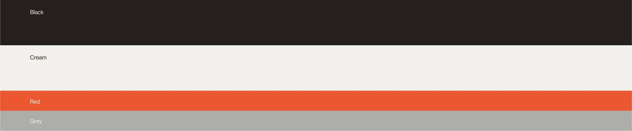
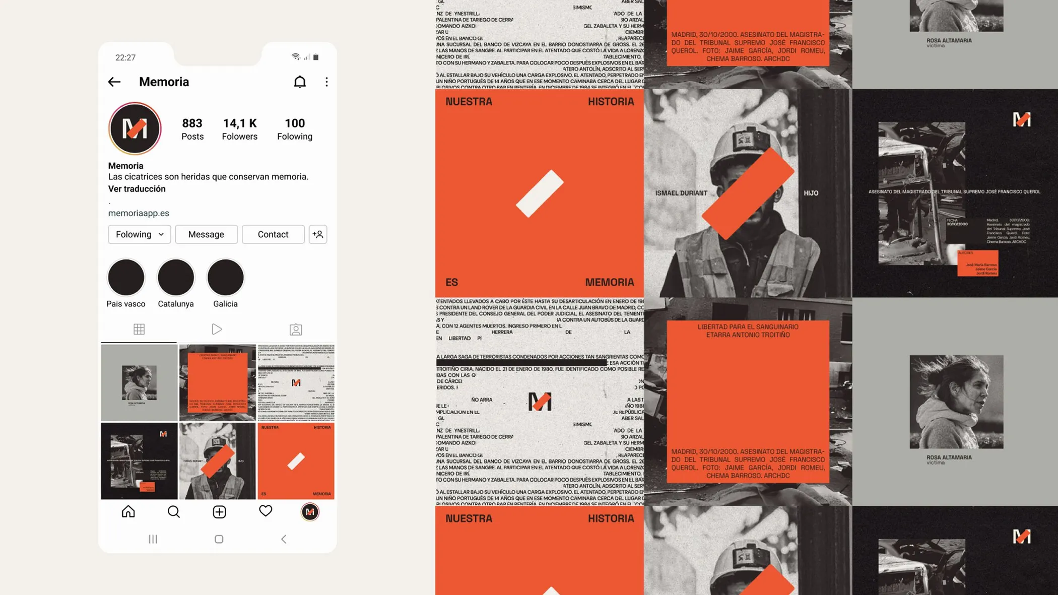
The red was the most important decision of the project, and also the one that went against the brief. Internally I knew it was the color the system needed, but I could not present something that went directly against a recommendation without making the case for it. I defined the base palette as neutral, to keep the focus on the text. Over that base, I tried greens and blues as accent colors. Neither generated the contrast the system needed. Red was always going to work better. An app that asks the user to stop in front of something important needs to mark. Red in its semantic use does not point to violence, it points to attention: something here is worth noticing. With that reading I prepared two moodboards, one with red and one without, before moving forward on any element. The client chose the first one, grounded in the argument and in the contrast it created against the neutral palette.
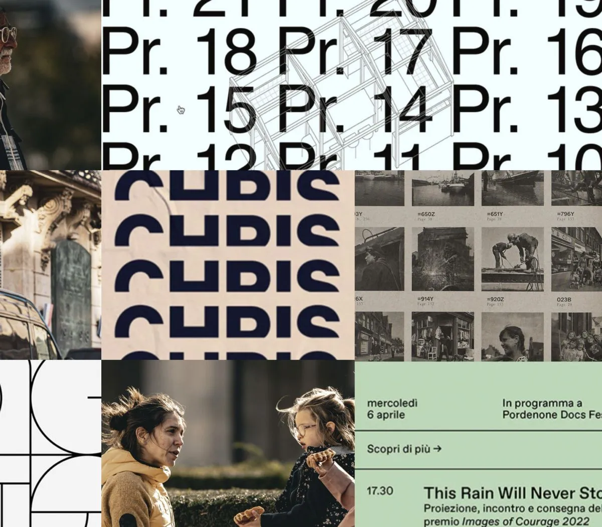
I defined the typography with a specific goal: build a system for reading. Ninety percent of the content was going to be text and information, so the typographic combination had to work at that density without becoming heavy. I chose DM Sans in its condensed variant for body text: it has a specific text gray, dense but legible, that balances the empty areas of the system. Space Grotesk in uppercase for headlines adds more visual weight and more assertiveness as a counterpoint. The contrast between the two creates the newspaper or case-file atmosphere the project needed.
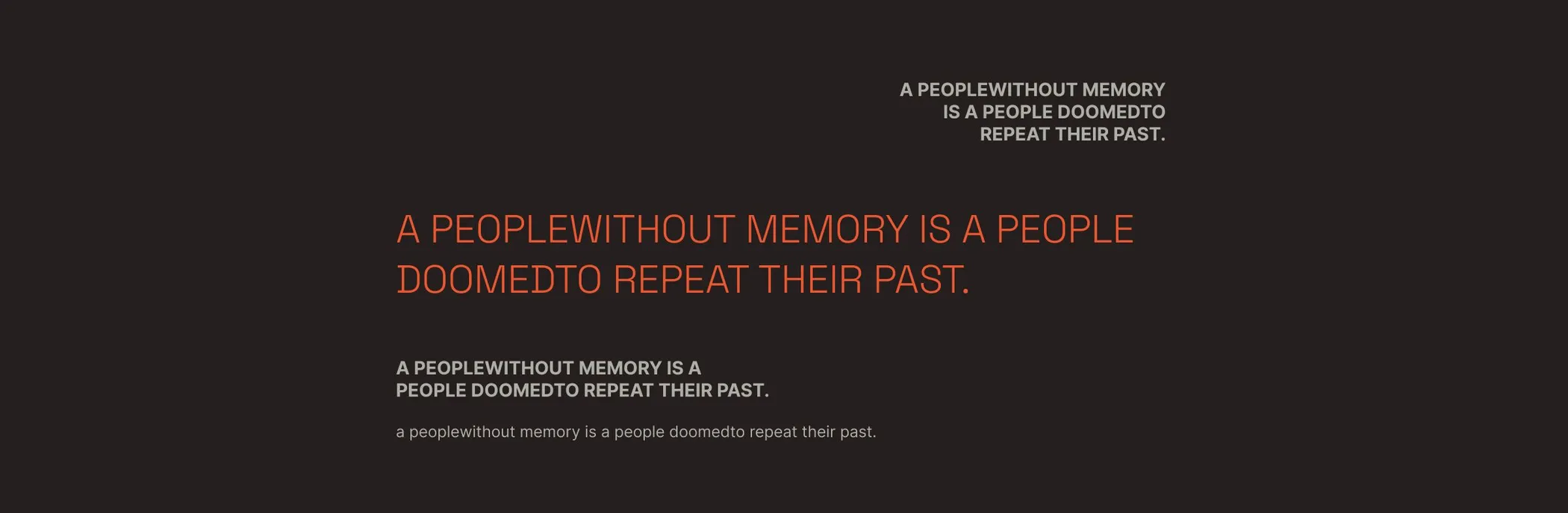
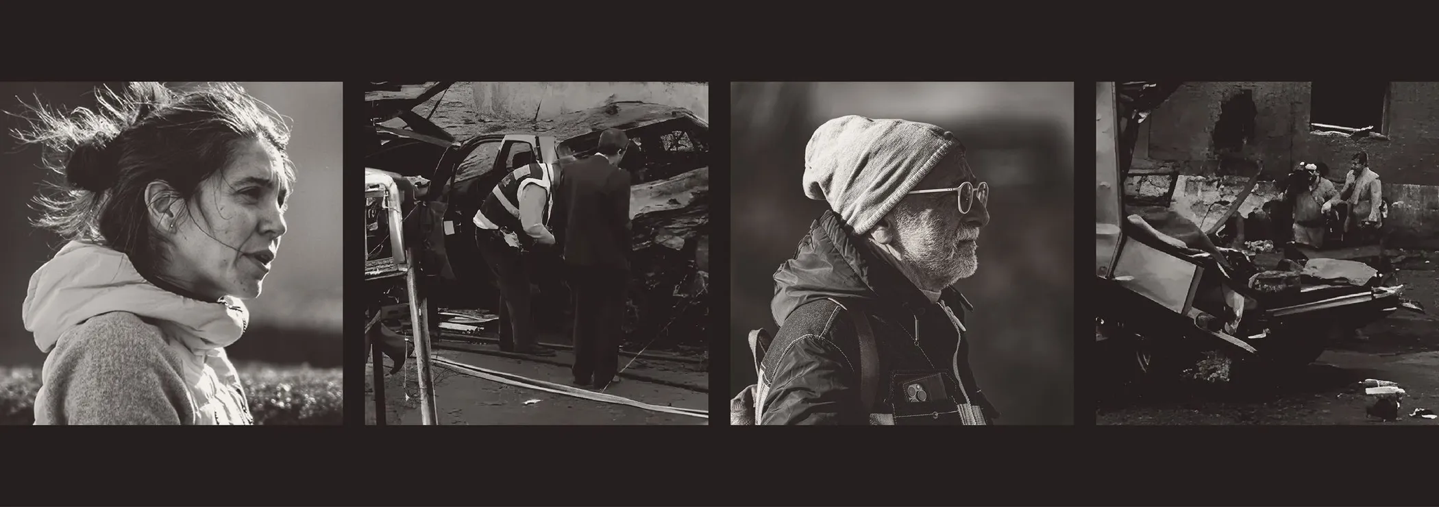
For the images I looked for people photographed from behind, no visible face. Someone is present, but cannot be recognized because they are no longer there. In the compositions I carried the same idea into the text: words with gaps, incomplete but still readable.
The visual system was adopted without modifications by the team that implemented it into the interface. The app launched on the App Store and Google Play in April 2024 with 200 attacks documented across 13 autonomous communities and 86 cities, got national media coverage, and won a Publifestival Award that October. I designed the identity, not the app.
Moodboards are not a preliminary step before the real work, they are the real work when the territory is ambiguous. Aligning on the visual direction before building the system brought the client on board from the start and avoided pushback later.