Skip to content
PORTFOLIO
LINKEDINABOUT

Errate

[x]
BRANDING

A fictional festival named after the error itself. Glitch pushed into high and low contrast, illegible text, dreamlike imagery. Crystal Castles, Björk, The Knife, A Clockwork Orange, Akira.

[prev][next]
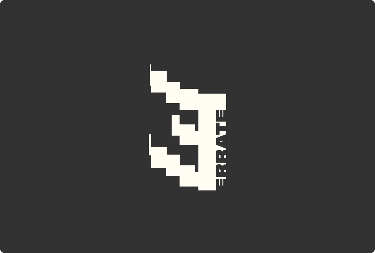
The festival isotype: a letterform broken into pixels
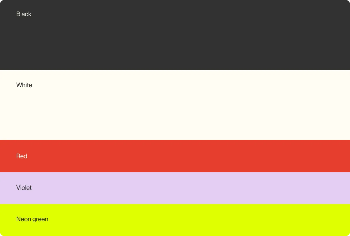
Colour palette: black, white, red, violet and neon green
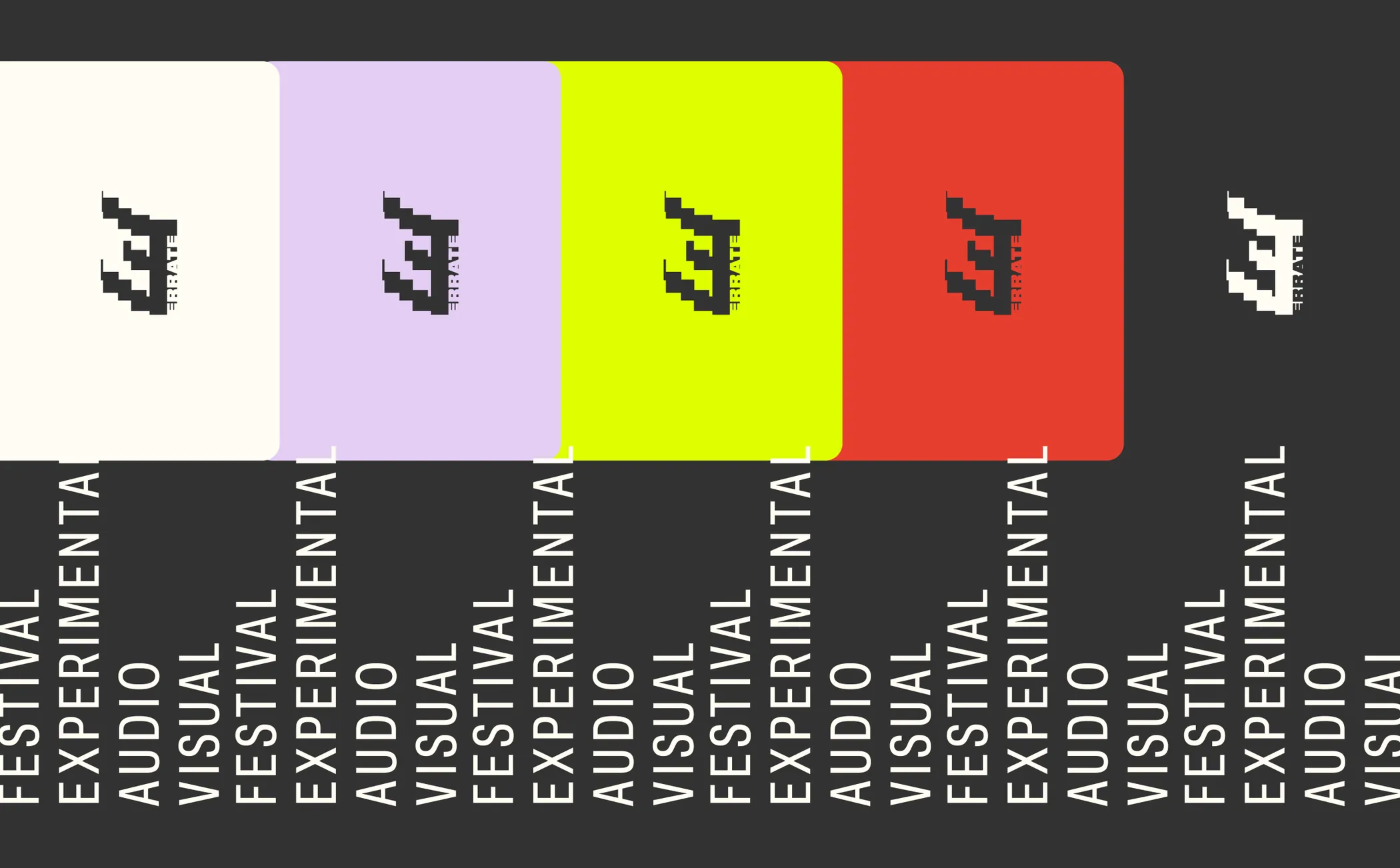
The isotype repeated across the five palette colours, over columns of vertical text
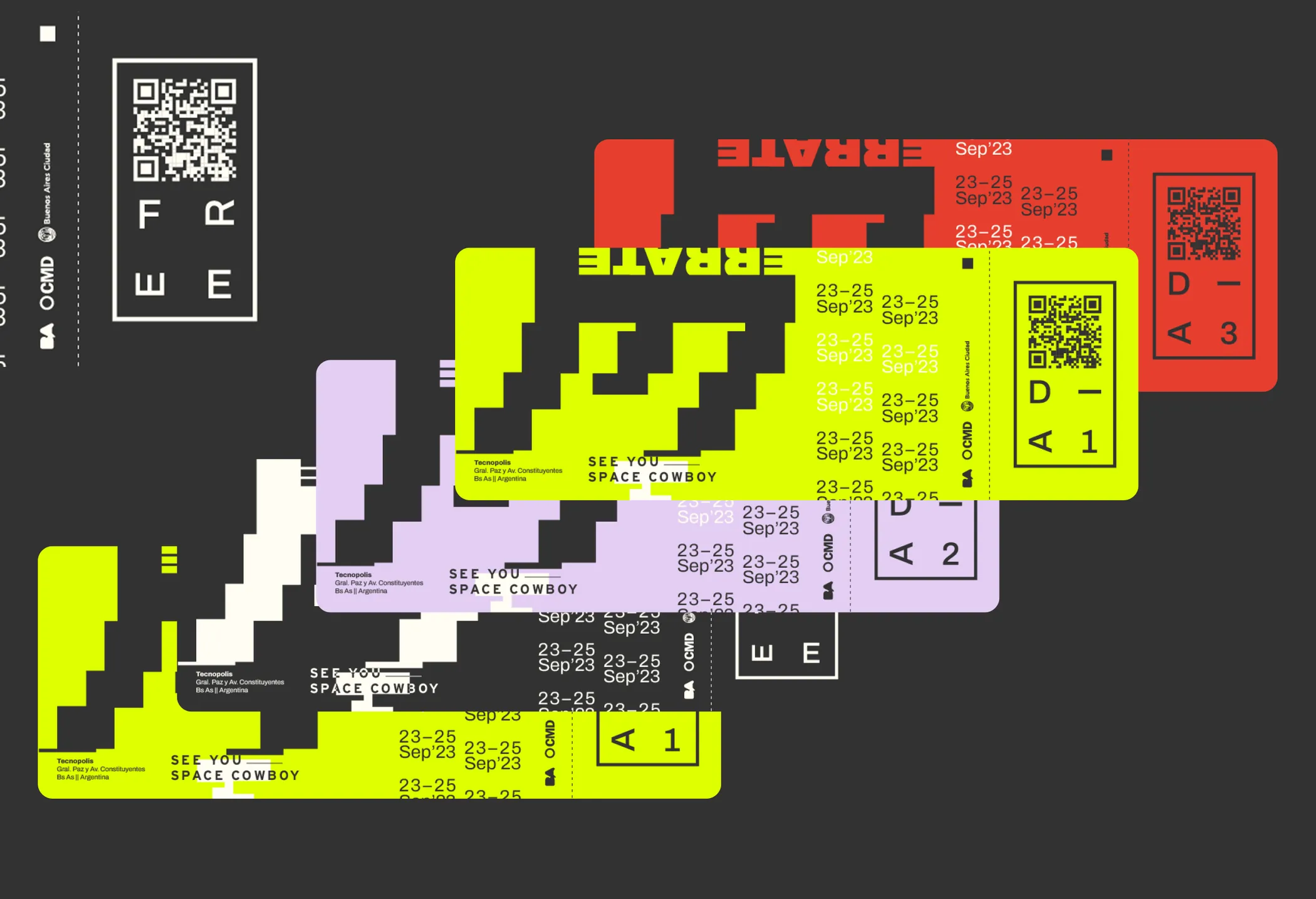
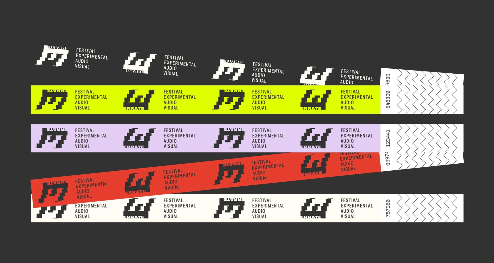
Tickets and passes in neon green, violet and red, each with a QR code
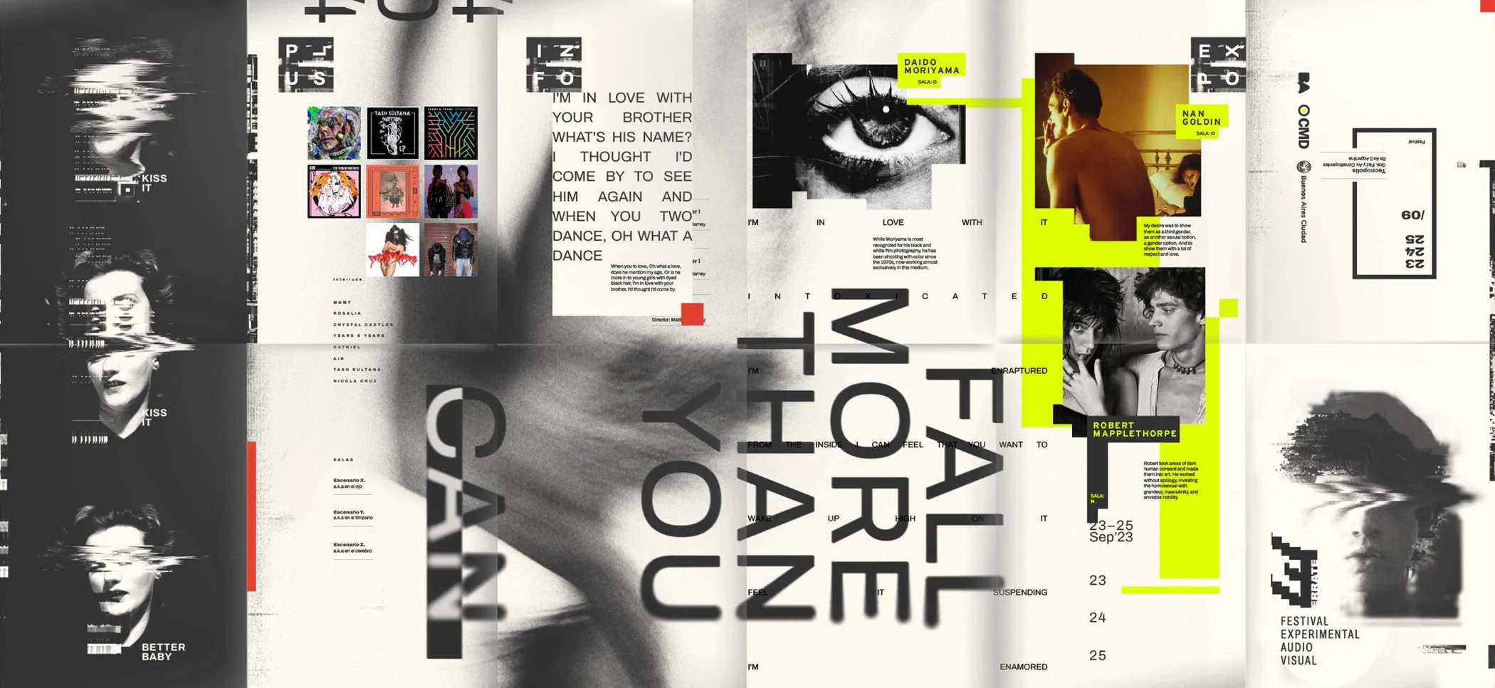
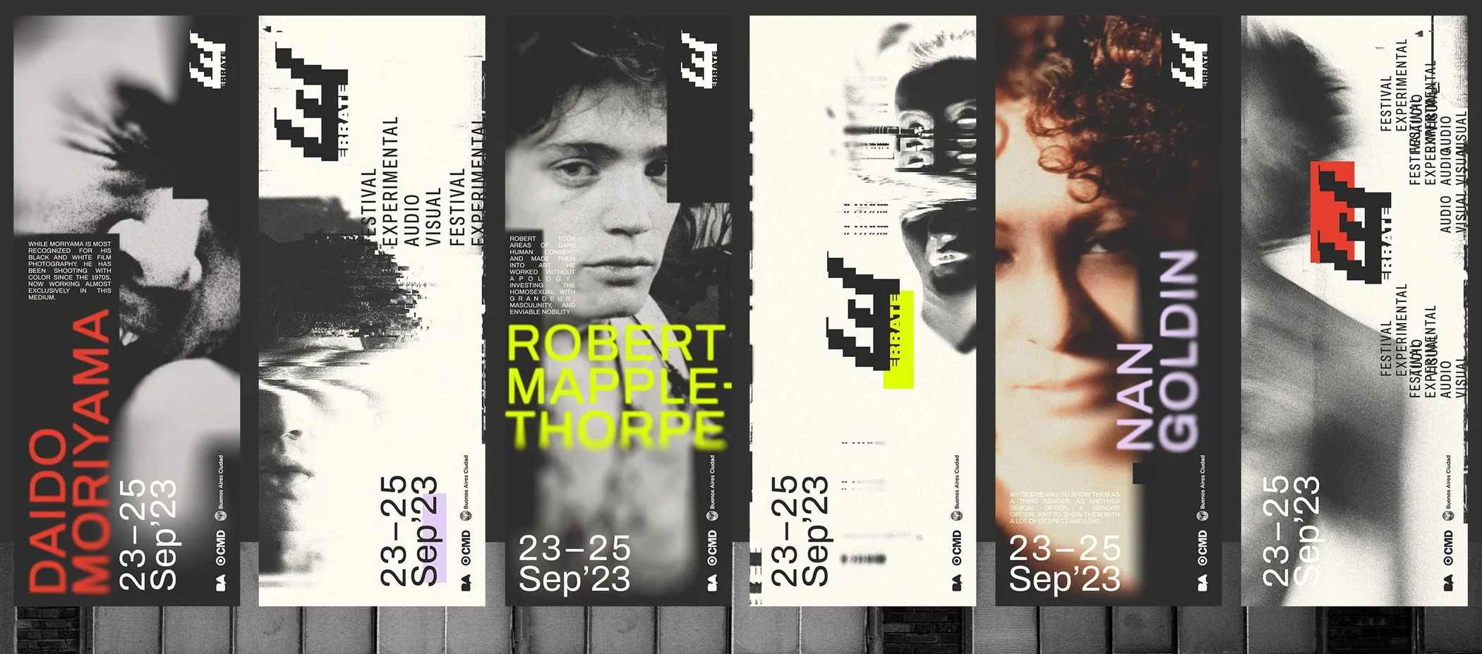
Poster spread: high-contrast portraits with the line "Fall more than you"
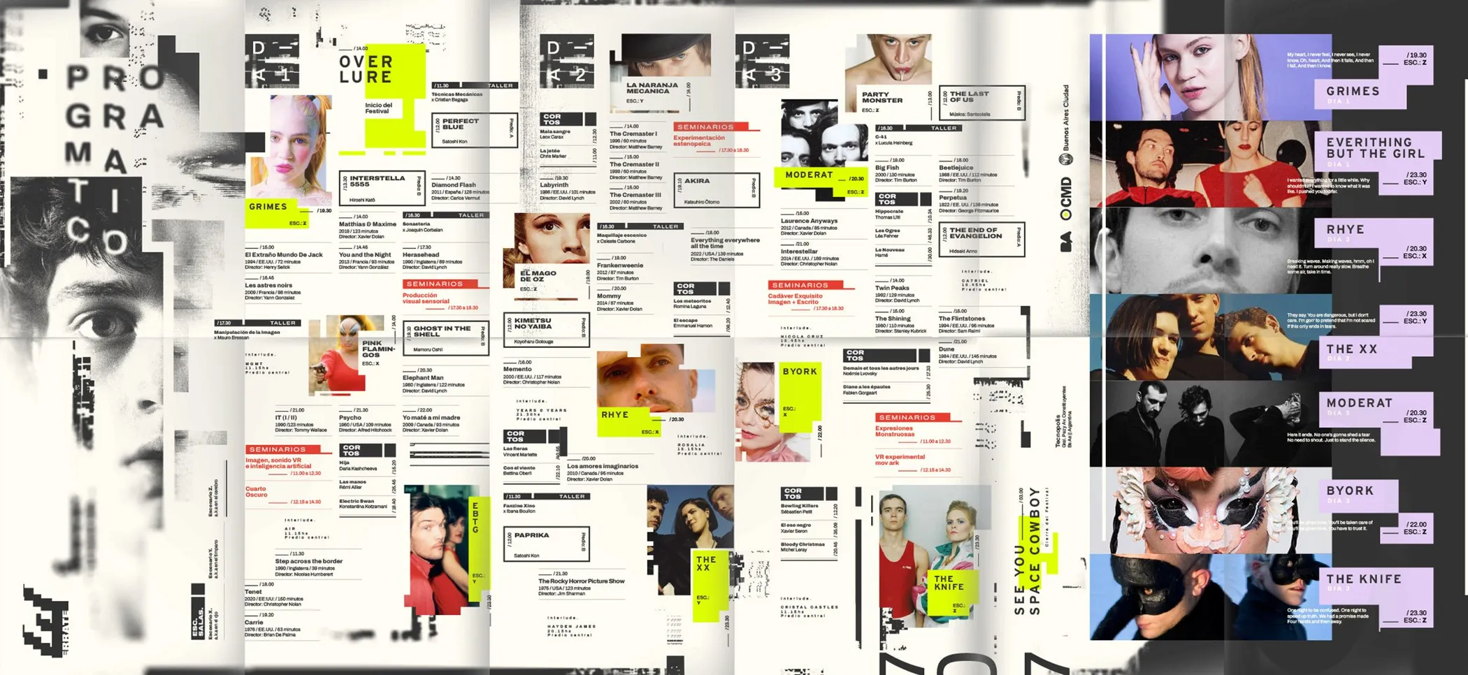
Programme spread: a dense grid of photographs, text and neon highlights
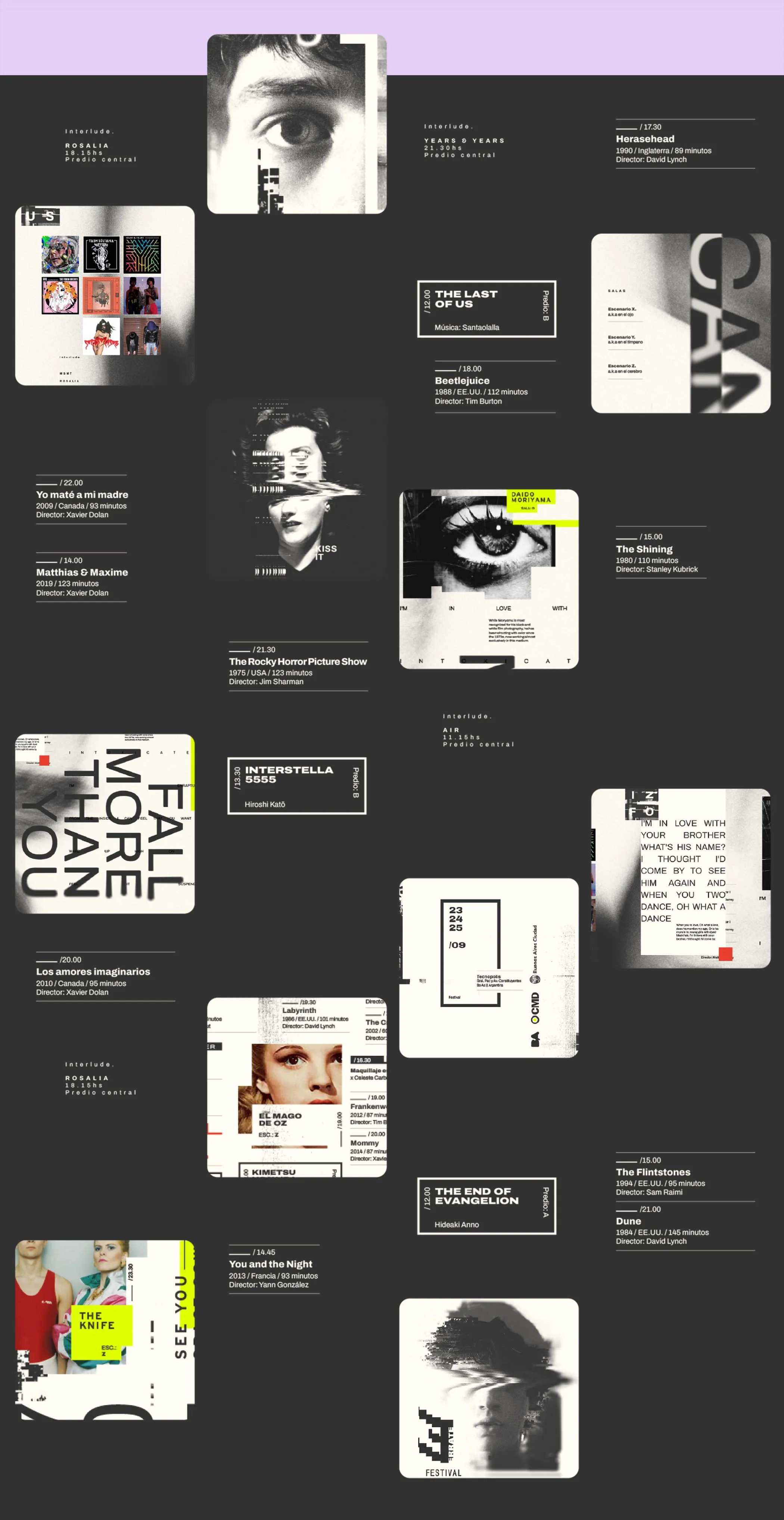
Full poster: portraits, captions and text blocks over a violet band
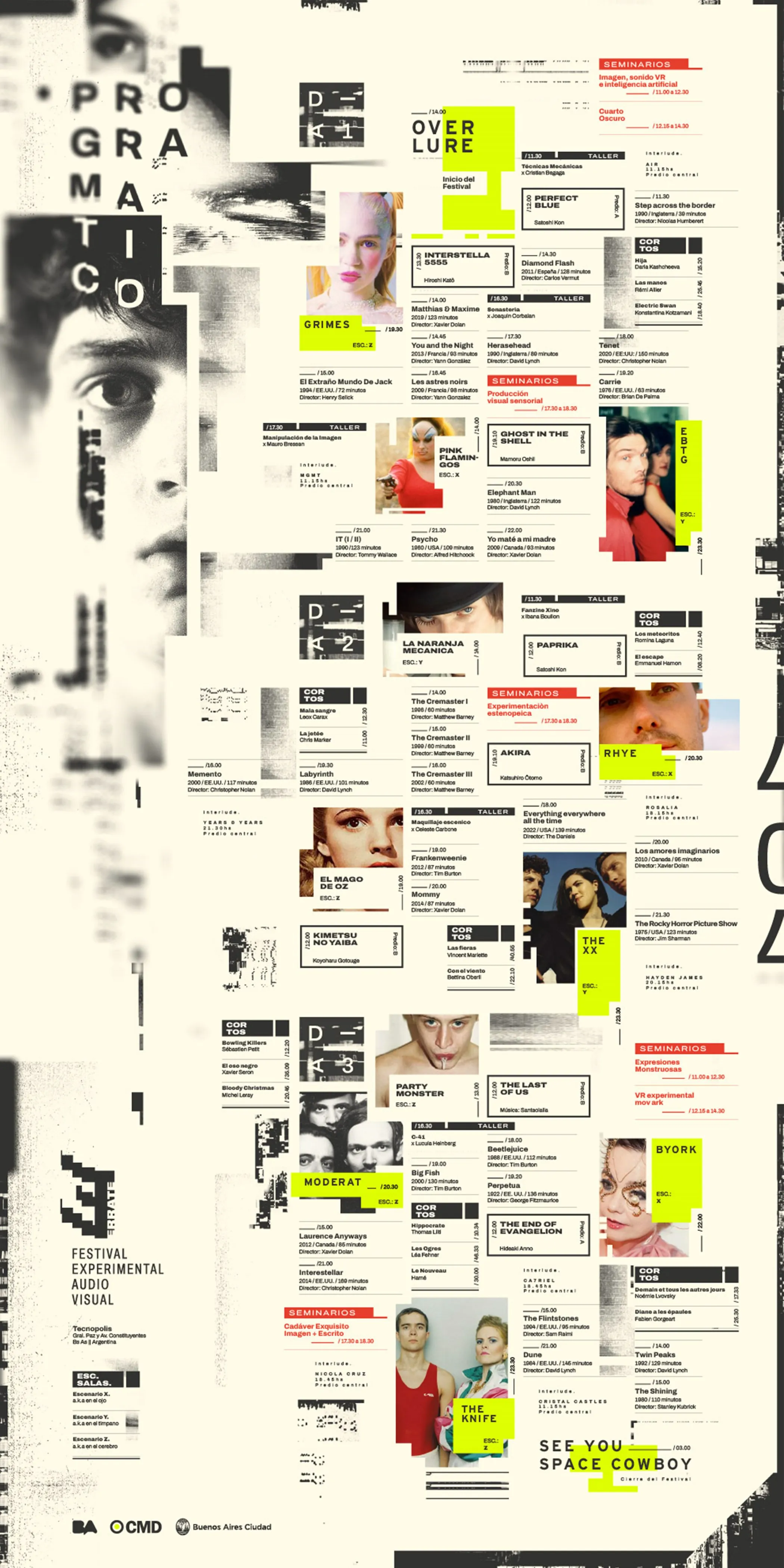
Long-format programme poster: columns of text and images with neon accents
Festival wristbands in the palette colours, repeating the isotype
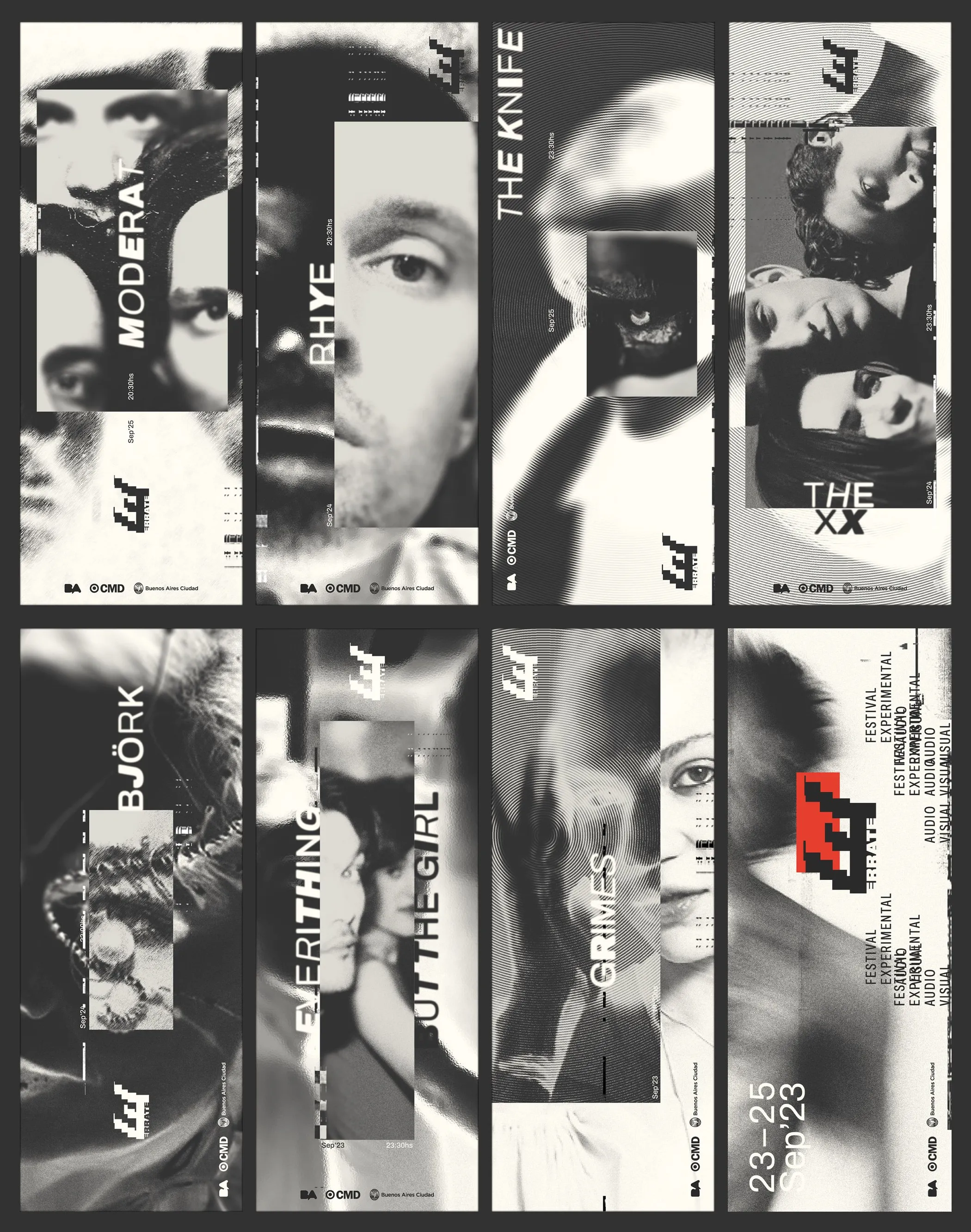
Poster series for the festival's guest names, in black and white
Poster grid for the musical line-up, each with an artist portrait
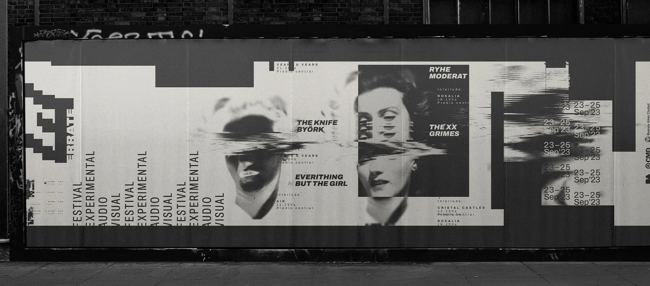
The poster series pasted along a street wall
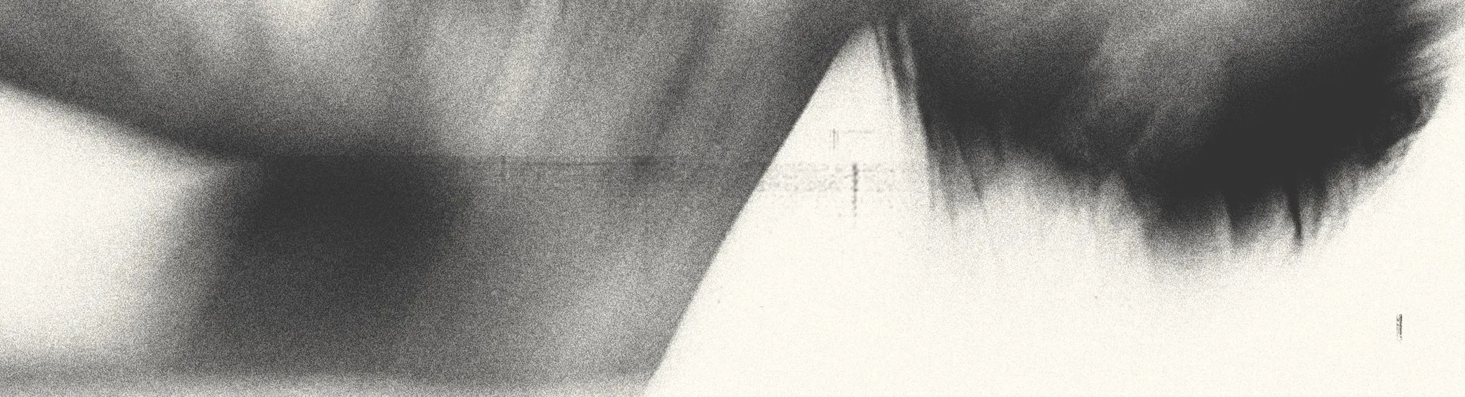
Long-exposure photograph, blurred, in warm greys
[prev][next]
NN