Skip to content
PORTFOLIO
LINKEDINABOUT

Zeta

[x]
BRANDING

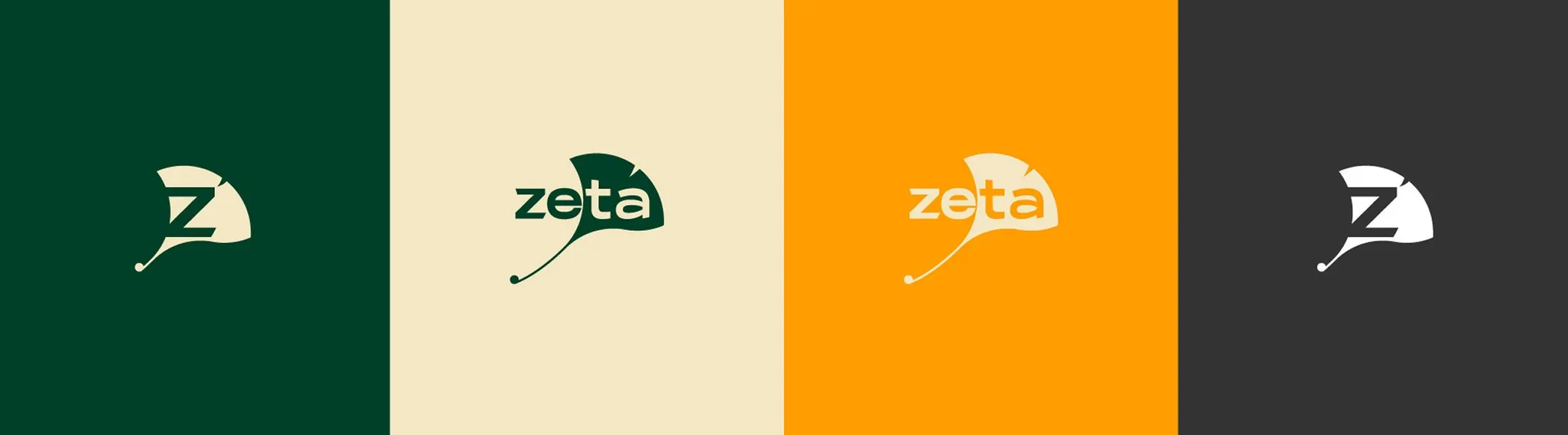
The leaf became the Z. The Z became the brand. Argentine seed company, sunflower and sorghum, built on the Ginkgo tree: tenacity in Chinese culture, and the morphology the isotype came from.

[prev][next]
The isotype's construction: the name, the Z and the ginkgo leaf
The logo across four backgrounds: green, beige, orange and dark grey
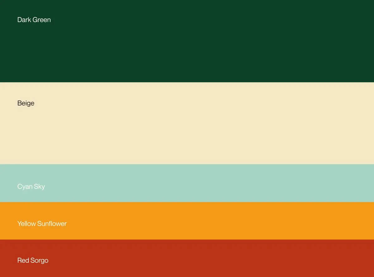
Colour palette: dark green, beige, cyan sky, yellow sunflower and red sorgo
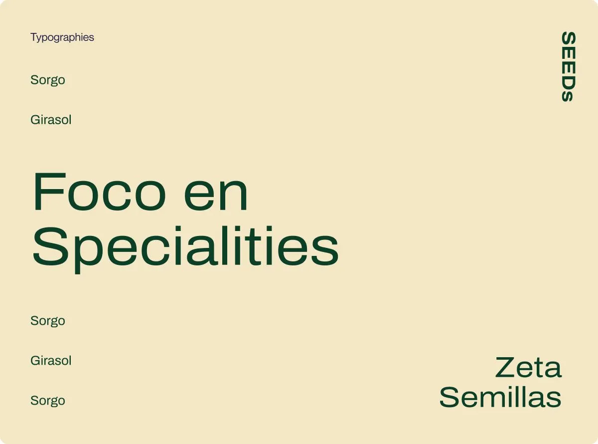
Typography slide: "Foco en Specialties"
Two panels of crop patterns, in orange and red
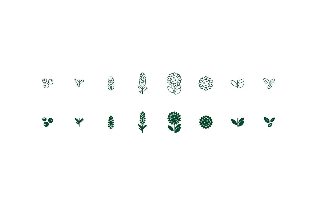
Icon set of seeds and sprouts, in outline and solid
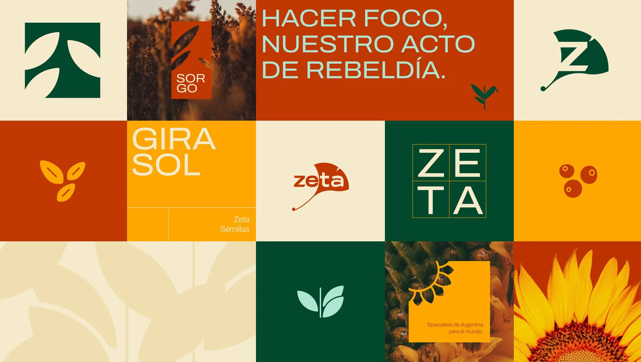
Brand board: statements, photographs and graphic elements
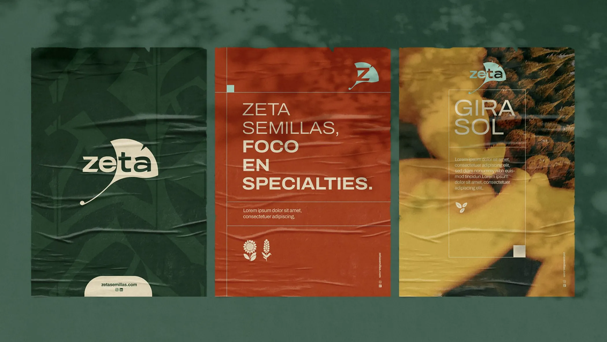
Printed pieces laid over a dark green field
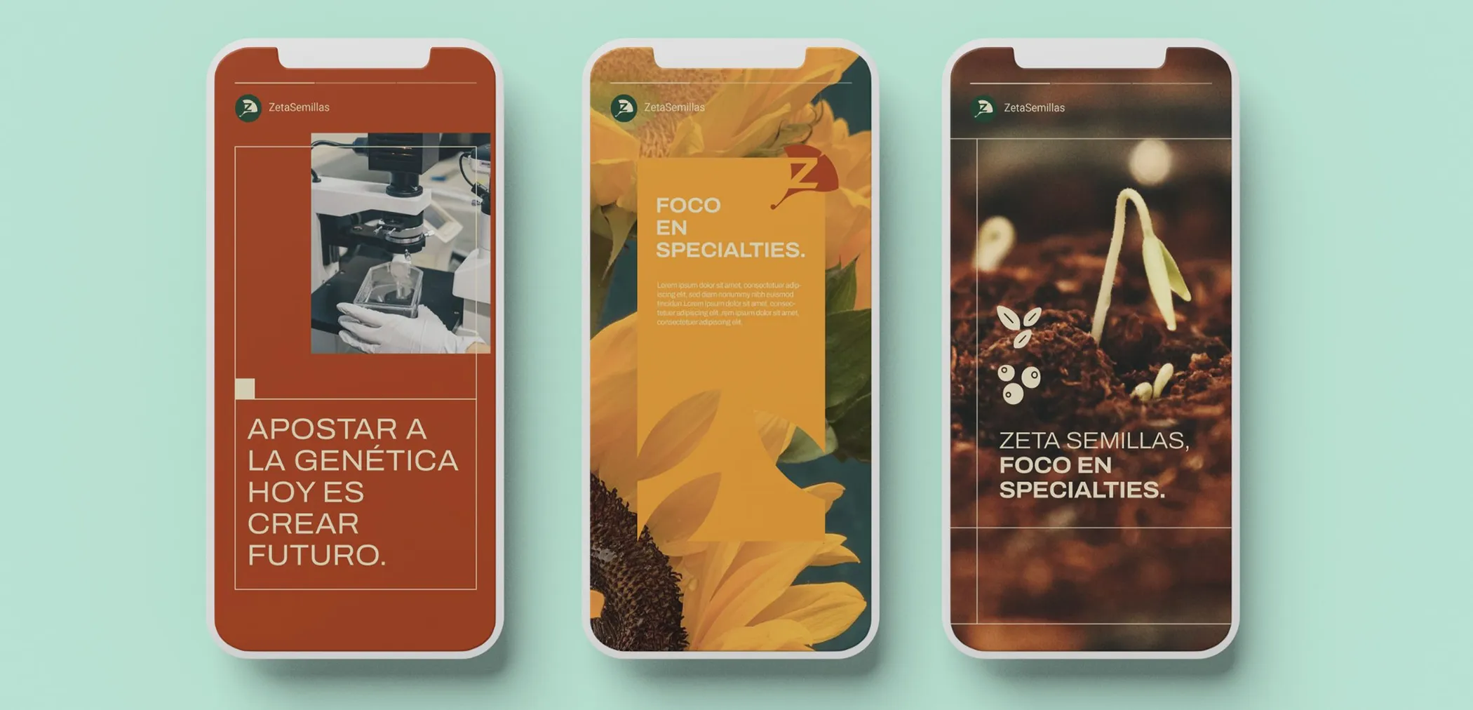
Three phones showing the brand's social posts
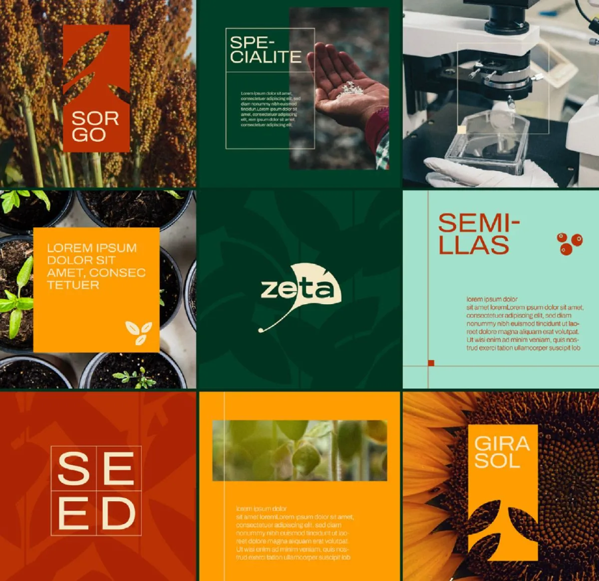
Social media grid: crops, laboratory and product panels
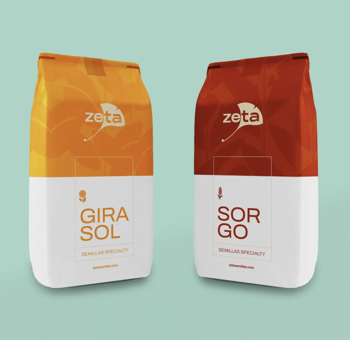
Two seed bags, sunflower and sorghum, in the brand colours
[prev][next]
NN